
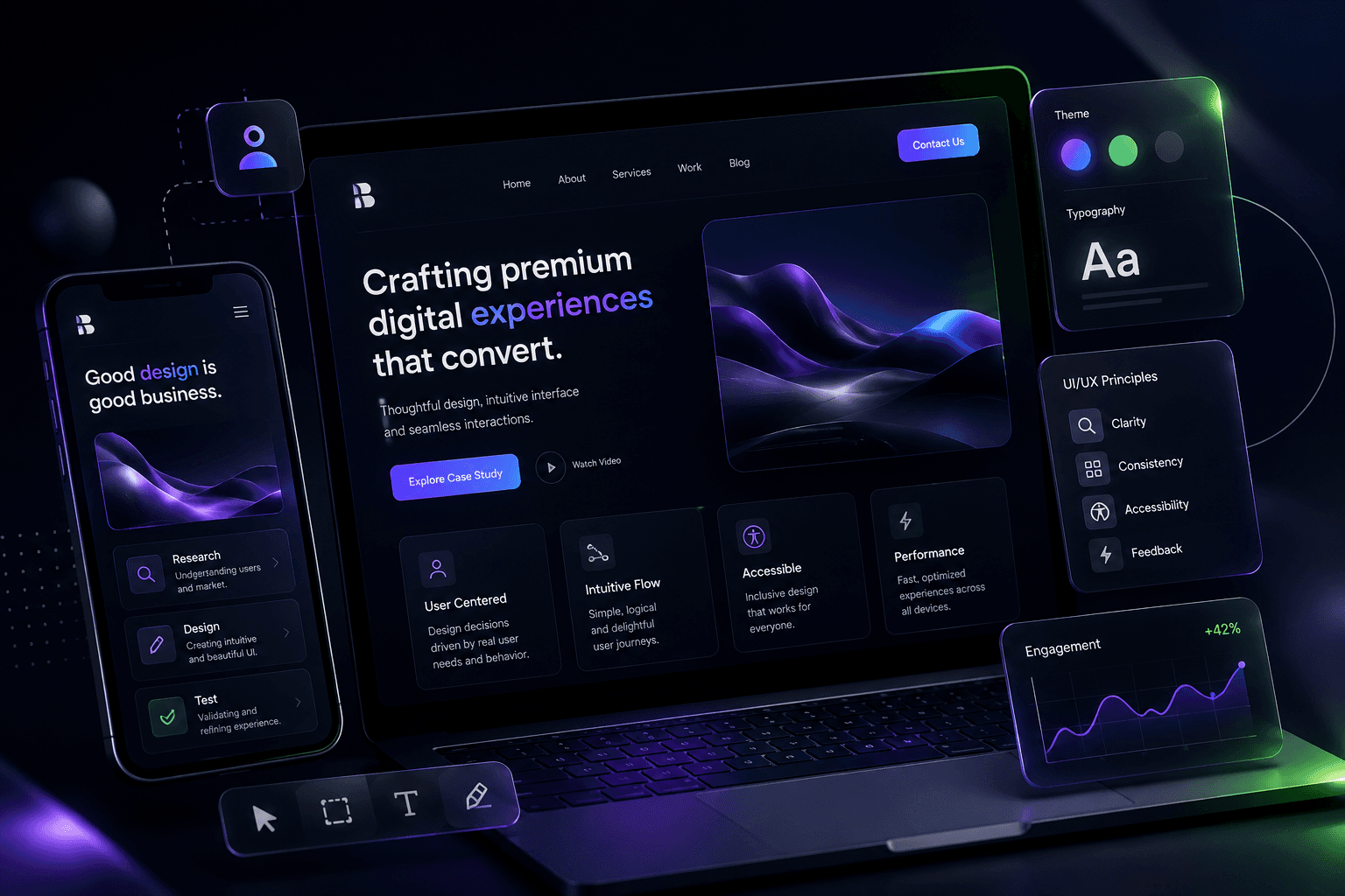
Users judge quality in milliseconds. Premium web experiences are not about flashy effects—they are about clarity, speed, and thoughtful detail that makes every interaction feel intentional.
Performance is UX
Before animation, before micro-interactions, before parallax—your site must load fast.
- Lazy-load images below the fold
- Use modern formats (WebP, AVIF) with fallbacks
- Minimize layout shift with explicit dimensions
- Keep JavaScript bundles lean
A beautiful interface that takes five seconds to load is not premium—it is frustrating.
Target a Largest Contentful Paint under 2.5 seconds and keep cumulative layout shift near zero.
Motion with purpose
Animation should communicate, not decorate. Every transition should answer: What changed, and why should the user care?
Good uses of motion
- Page transitions that maintain spatial context
- Hover states that confirm interactivity
- Staggered reveals that guide reading order
- Loading states that reduce perceived wait time
Motion guidelines
const premiumEasing = [0.16, 1, 0.3, 1];
const duration = { fast: 0.2, normal: 0.35, slow: 0.5 };
Keep durations under 500ms for UI feedback. Use spring physics sparingly for playful elements—not for every button.
Typography and reading comfort
Long-form content needs a comfortable measure—typically 65–75 characters per line, or roughly 700–800px max width.
Headings should be unmistakable
Use size, weight, and spacing—not color alone—to establish hierarchy. H1 for page title, H2 for sections, H3 for subsections. Never skip levels.
Spacing rhythm
Consistent vertical rhythm (multiples of 4 or 8px) makes layouts feel cohesive. Section padding should breathe on large screens and compress gracefully on mobile.
Layout and visual hierarchy
Guide the eye with clear focal points. Use whitespace deliberately—it is not empty space, it is structure. Group related elements and separate unrelated ones with consistent spacing.
Accessibility as a quality signal
Premium products work for everyone:
- Semantic HTML (
nav,main,article,section) - Visible focus states on all interactive elements
- Color contrast ratios of at least 4.5:1 for body text
- Keyboard navigation for menus, modals, and carousels
aria-labelon icon-only buttons
Mobile-first, not mobile-afterthought
Design for the smallest screen first. Touch targets should be at least 44×44px. Avoid hover-only interactions. Test thumb reach zones for primary actions.
Navigation patterns
Bottom navigation works well for content-heavy sites with frequent section switching. Top navigation suits marketing pages with fewer destinations. Pick one pattern and commit—hybrid approaches confuse users.
Forms and input design
Reduce friction in every form field. Label inputs clearly, show inline validation, and preserve user input on errors. Autofocus the first field and support keyboard submission.
Content strategy for interfaces
Microcopy matters. Button labels should describe outcomes ("Book a Session" not "Submit"). Error messages should explain how to fix the problem, not just what went wrong.
The premium difference
Premium UX is the sum of small decisions: consistent border radii, subtle glass effects, purposeful whitespace, and copy that respects the user's time.
If you are looking to elevate your web presence, check out my dedicated UI/UX Design Services, custom Web Development Services, and interactive Motion Graphics Services. Ship fewer features, but ship them flawlessly.
Book a Session
Ready to bring your brand to life? Schedule a free consultation and let's discuss your project.
Book NowFree 30-min discovery call
Comments
No comments yet. Be the first to share your thoughts.