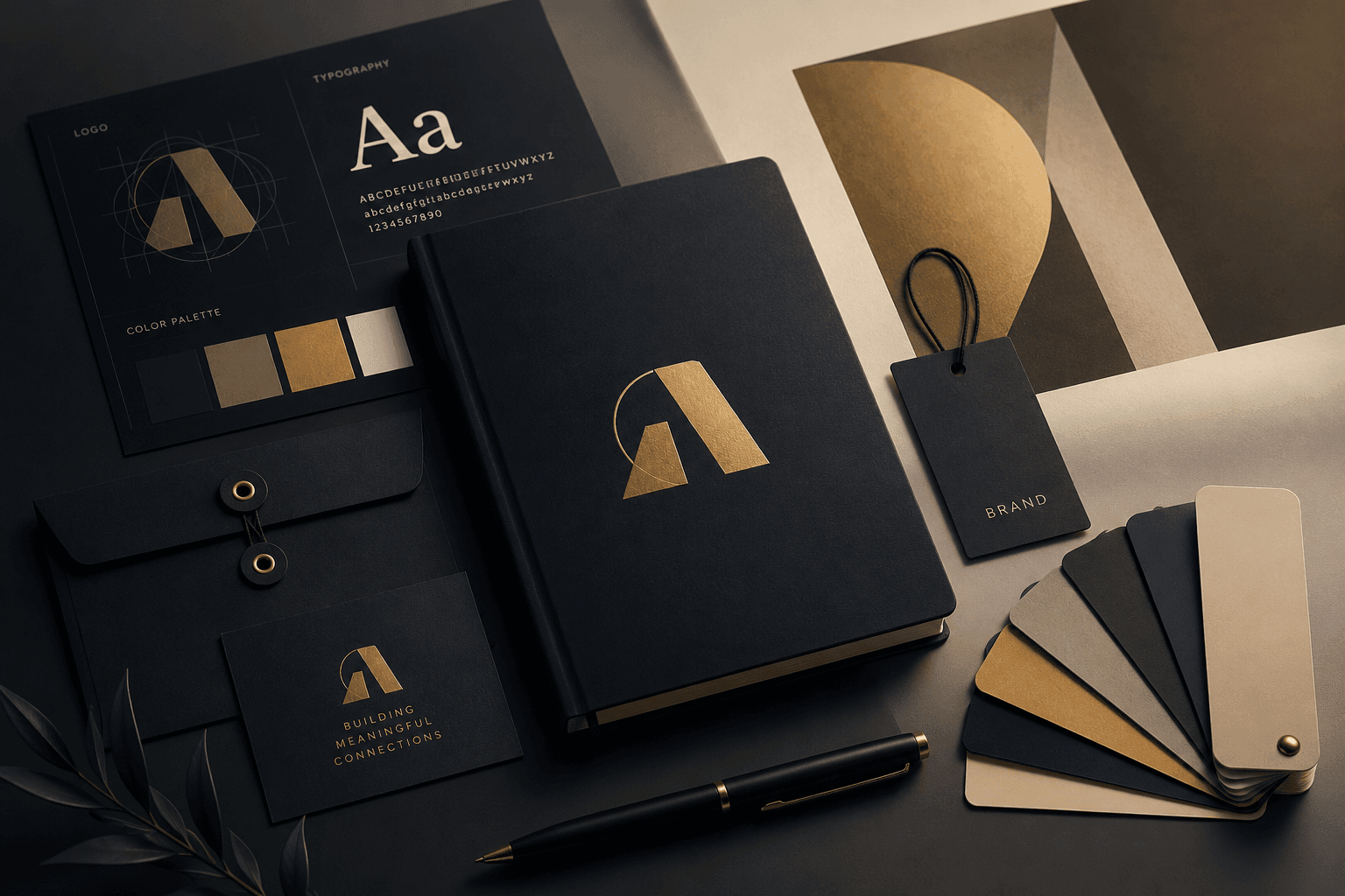
A logo is not a brand. It is one expression of a much larger system—a system that should feel unmistakable whether someone sees your website, packaging, or a social post.
What brand identity actually means
Brand identity is the visual and verbal language that communicates who you are, what you stand for, and why people should care. It includes:
- Logo and mark variations
- Color palette and typography
- Imagery style and iconography
- Tone of voice and messaging
- Application guidelines
Identity is the bridge between strategy and perception. Design without strategy is decoration.
The five pillars of a strong identity
1. Distinctiveness
Can someone recognize your brand in a crowded feed without seeing the logo? Distinctiveness comes from unique color combinations, typography choices, and layout patterns—not gimmicks.
2. Consistency
Every touchpoint should feel like it belongs to the same family. Create a brand guide that covers:
- Minimum logo sizes and clear space
- Approved color combinations
- Typography hierarchy for print and digital
- Do's and don'ts with real examples
3. Flexibility
Modern brands live everywhere—favicons, app icons, billboards, embroidery. Design systems that scale down to 16px and up to building-sized without losing integrity.
4. Relevance
Trendy design dates quickly. Ground your identity in the brand's values and audience, not whatever is popular on Dribbble this month.
5. Memorability
Simple shapes, limited palettes, and clear concepts stick. The best marks can be drawn from memory after seeing them twice.
From concept to system
Here is a practical workflow I use for client projects:
Discovery → Strategy → Concept → Refinement → System → Guidelines
During discovery, ask questions that reveal personality:
- If this brand were a person, how would they dress?
- What should customers feel after interacting with you?
- Who are you definitively not?
Common mistakes to avoid
| Mistake | Better approach |
|---|---|
| Too many logo variations | 3–5 max: primary, secondary, icon, monochrome |
| Generic stock photography | Custom or curated imagery with consistent treatment |
| Ignoring digital-first | Design for screens, then adapt to print |
| No written guidelines | Document decisions so the brand survives without you |
Building a brand identity is an investment. If you need a complete visual identity tailored for your business, explore my professional Brand Identity Design Services and Graphic Design Services. Done well, a strong brand identity compounds—every piece of content, every product, every interaction reinforces the same story.
Color psychology and palette design
Colors carry cultural and emotional weight. Limit primary palettes to 2–3 core colors plus neutrals. Document exact hex values, RGB, CMYK, and Pantone equivalents for cross-medium consistency.
Primary, secondary, and accent roles
Assign clear roles: primary for brand recognition, secondary for support elements, accent for calls-to-action. Test palettes in both digital and print contexts before finalizing.
Typography as brand voice
Typefaces communicate personality before a single word is read. A geometric sans feels modern and clean; a serif conveys tradition and authority. Pair no more than two typefaces—one for headlines, one for body.
Logo design principles
Great logos are simple, scalable, and memorable. Design in black and white first—color is enhancement, not crutch. Test at 16px (favicon) and billboard scale before delivery.
Brand guidelines that get used
Guidelines nobody reads fail the brand. Keep them visual, concise, and accessible. Include real application examples, not abstract rules. PDF and web versions both serve different audiences.
Launching and evolving your identity
Roll out consistently across all touchpoints simultaneously when possible. Gather feedback after 90 days and refine—not rebrand—based on real usage data.
Book a Session
Ready to bring your brand to life? Schedule a free consultation and let's discuss your project.
Book NowFree 30-min discovery call
Comments
No comments yet. Be the first to share your thoughts.